Creating a scatter plot in Google Sheets is a straightforward process that involves selecting your data and inserting a chart. Google Sheets provides a simple and efficient way to create scatter plots for data analysis. Whether you’re a student or a professional, learning how to make a scatter plot in Google Sheets can greatly enhance your data visualization skills.
In this quick guide, we’ll walk you through the step-by-step process of making a scatter plot in Google Sheets so that you can easily create your own scatter plots and analyze your data with ease.
Step-by-Step Guide to Making a Scatter Plot in Google Sheets
Here are the exact steps you should follow to make a scatter plot in Google Sheets:
1. Prepare your data: Make sure your data is well-organized in two columns, with one representing the X-axis and the other representing the Y-axis.

2. Select the data: Click and drag your mouse to select the entire data range, including the column headers.
3. Open the “Insert” tool: Click on the “Insert” menu at the top of the page, and select “Chart” from the dropdown.

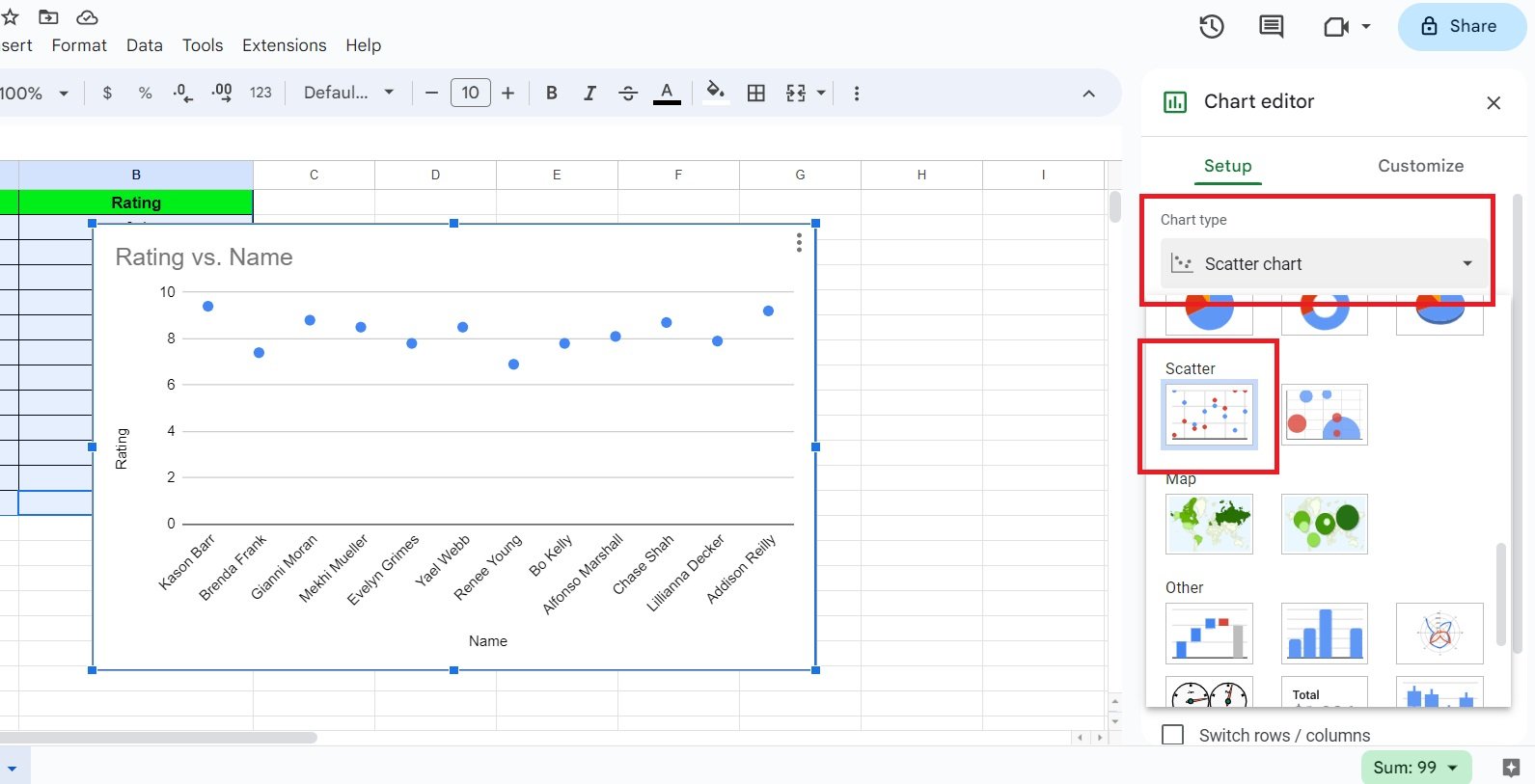
4. Choose scatter plot chart type: In the Chart editor pane that appears on the right, click on the “Chart type” dropdown menu and select “Scatter” from the list.
You can use the options available in the Chart editor pane to modify the appearance, labels, and other elements of the chart as needed.

That’s it! Following these steps will help you create an informative scatter plot in Google Sheets, enabling a clear visualization of the relationship between your data variables.
Conclusion
Making a scatter plot in Google Sheets is a simple and effective way to represent the relationship between two variables in your data visually. Following the steps outlined in this quick guide, you can easily create a scatter plot in Google Sheets and use it to gain insights into your data.
So go ahead and create your own scatter plot in Google Sheets today and take your data analysis to the next level!


